The part most people would skip
The obvious answer was to “get a CRM.”
That conversation happened. More than once.
HubSpot. Monday. A few others. All perfectly capable tools, all designed to bring order to messy processes.
The problem was – they assume you already know what your process is.
I didn’t.
Or more accurately: there were pieces of a process, spread across different people, habits, and assumptions.
Trying to force that into a prebuilt system wouldn’t have fixed anything. It just would’ve made the confusion more organized.
So I stepped back
Before building anything, I had to answer a few deceptively simple questions.
- What actually counts as an opportunity?
- When does it move forward?
- Who owns it – and when does that change?
- What needs to be visible, and what doesn’t?
Not glamorous work. But without it, everything else is guesswork.
Once those answers started to take shape, the path forward became a lot clearer.
What I actually built
Not a concept. Not a prototype.
A working CRM designed around how the team actually operates.
Contacts, opportunities, tasks, dashboards, reporting – all of it connected in a way that reflects real behavior instead of ideal workflows.
Which sounds obvious, but rarely is.
Because most systems are built around how things should work.
This one was built around how they do.
How it came together
A working scaffold was built early – then evolved into the full CRM as the system took shape.
Instead of designing it in isolation and handing it off, the structure became something people could actually click through, react to, and question while the tool was still taking shape.
Navigation wasn’t theoretical. Data wasn’t abstract. Interactions weren’t guesses.
People could move through it, react to it, and more importantly, point out what didn’t make sense.
That’s where things got better quickly.
Because feedback on something real is always sharper than feedback on something imagined.
The design (and where it actually matters)
This wasn’t meant to feel like a stripped-down interface.
It needed to feel like a tool people could rely on – quickly.
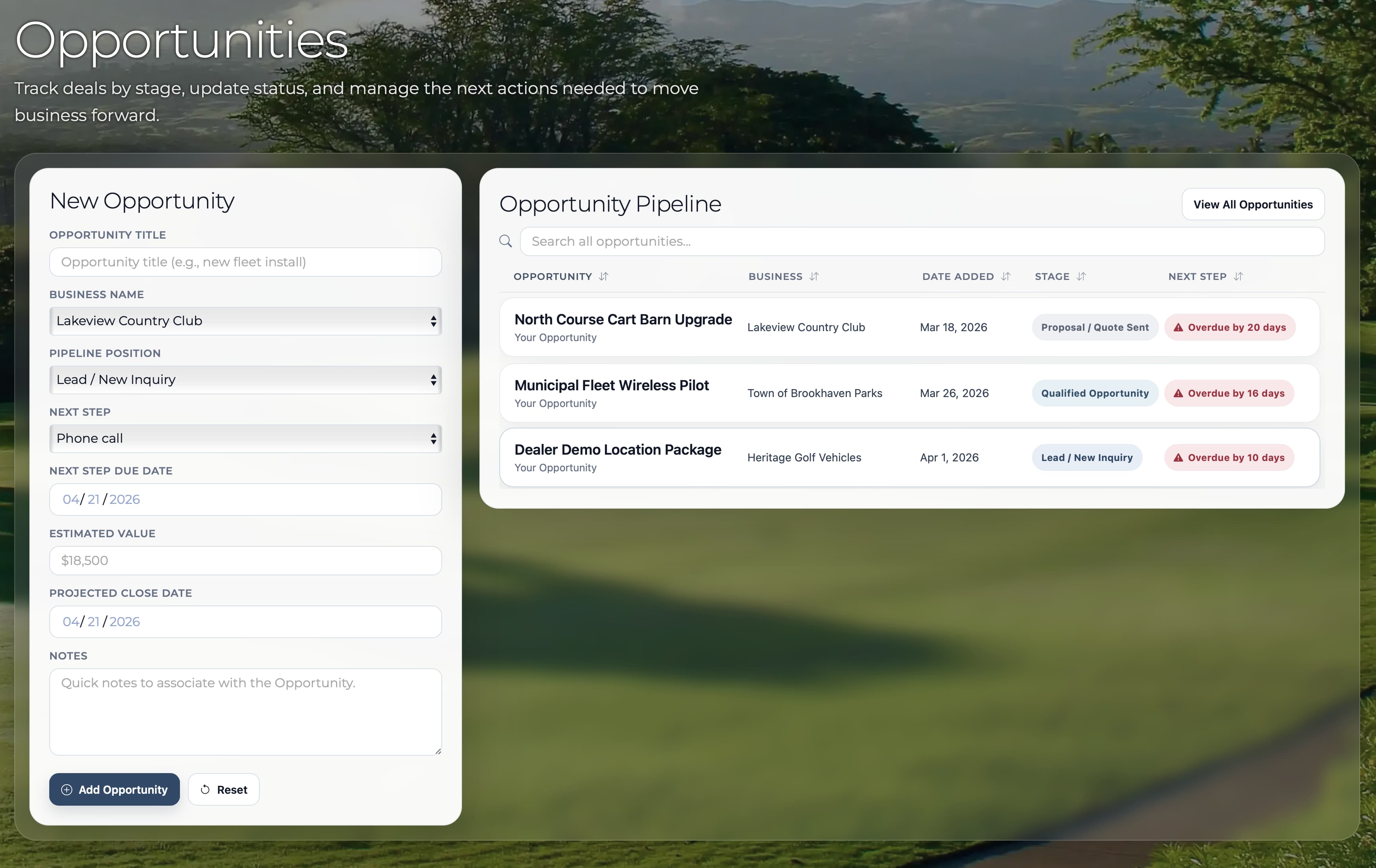
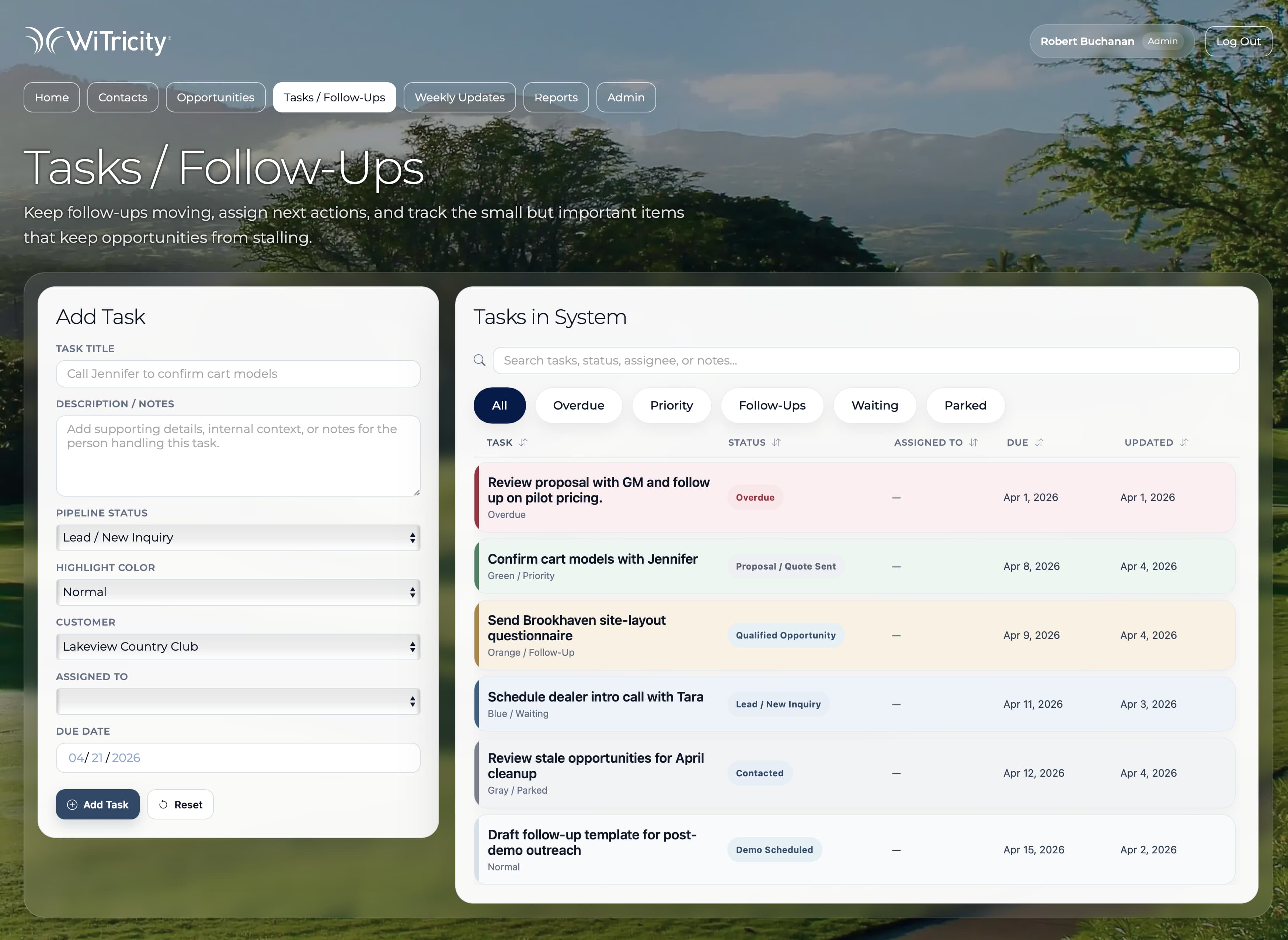
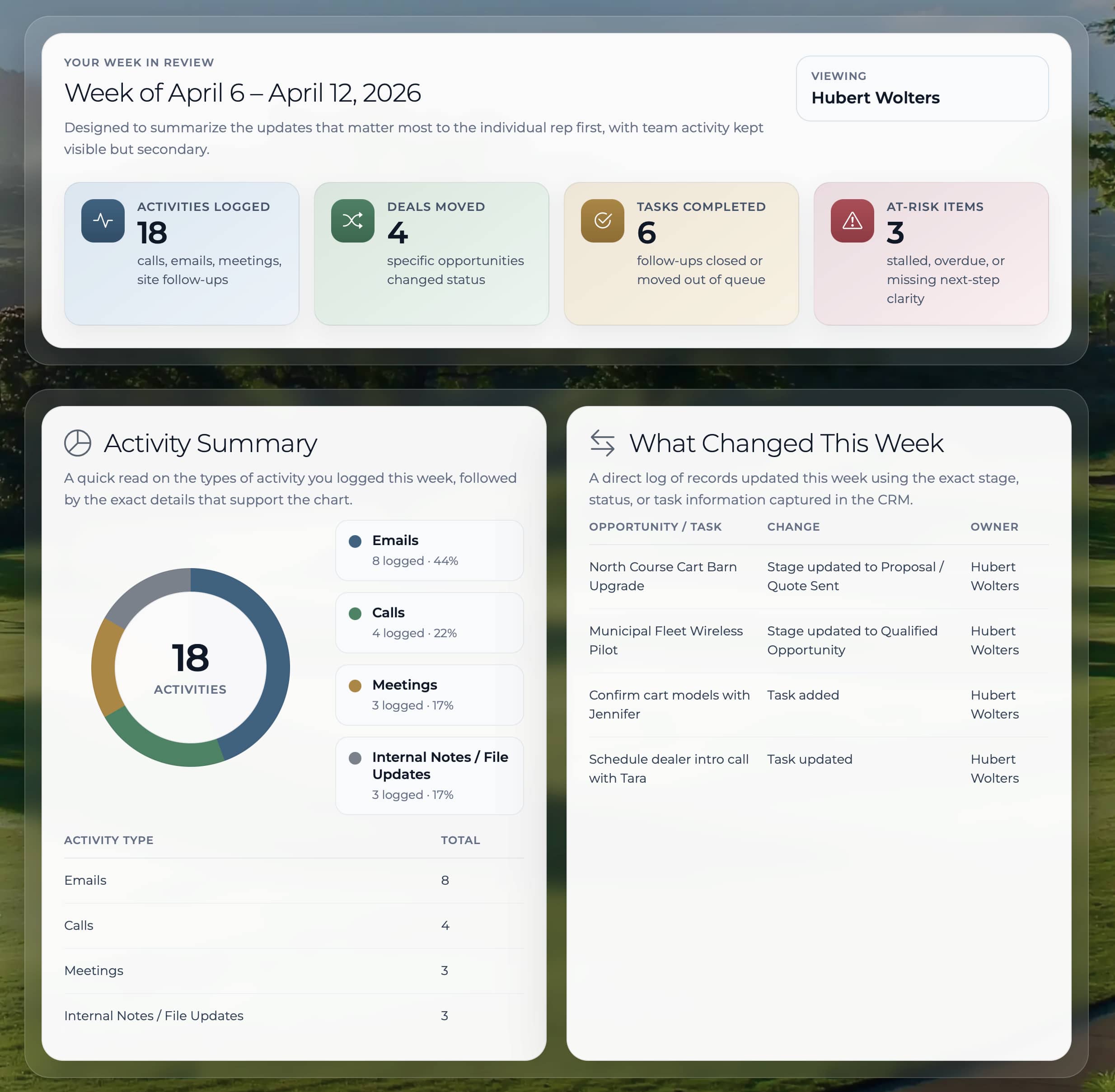
At a glance, you can see what needs attention, what’s moving, and what’s stuck.
Color isn’t decoration here – it’s signal. Overdue work stands out. Active deals read differently than new ones. The system communicates status before you click anything.
There’s structure underneath it:
- dashboards that prioritize what matters now
- pipeline views that show movement, not just data
- activity that makes recent changes visible
It’s not minimal for the sake of it.
It’s organized so you don’t have to think about where to look.
What changed
The biggest shift wasn’t visual. It was operational.
- opportunities were visible in one place
- ownership wasn’t a question
- follow-ups didn’t disappear
- the pipeline became something people could actually trust
And just as important – something I didn’t fully appreciate at the start – it gave the company something real to show.
Not just to the sales team, but to leadership and potential investors.
A working system tends to answer a lot of questions before they’re asked.
What this says about how I work
I don’t start with tools.
I start with how things actually function – or don’t.
Then I build systems that make that visible, usable, and scalable.
Sometimes that looks like design. Sometimes it looks like structure. Sometimes it looks like code.
In this case, it was all three.