Start with the idea
Style is not strategy wearing better shoes.
I do not want to choose a visual language because it happens to be fashionable, because a competitor used it, or because somebody found a reference on Pinterest five minutes before the meeting.
I want the look of the work to grow out of what the audience needs to understand and what the idea needs to feel like when it reaches them.
Sometimes that calls for restraint. Sometimes it needs to interrupt. Sometimes the most sophisticated answer is to stop decorating and let one strong idea carry the page.
The aesthetic should support the argument, not become a second argument competing with it.
Build the hierarchy
If everything is important, congratulations: nothing is.
One of the most useful things art direction can do is decide where the eye should go first, second, and third.
That hierarchy may come from scale, contrast, typography, photography, negative space, repetition, movement, or simply knowing which information does not deserve to shout.
I think about the experience in sequence rather than as a pile of elements that all successfully fit on the page.
Good composition is not just arranging things. It is deciding what gets attention and in what order to ensure you're telling a powerful visual story.
Direct the image
The image has a job before it has a crop.
Photography and illustration can establish the entire emotional temperature of an assignment before the headline gets a chance to explain itself.
So I care about more than finding something attractive. I care about point of view, subject, gesture, environment, lighting, scale, and whether the image is actually carrying the idea.
Sometimes that means selecting photography. Sometimes it means developing a concept, creating or directing imagery, compositing elements, retouching, illustrating, or pushing an existing asset until it finally belongs with the communication around it.
A beautiful image that tells the wrong story is still the wrong image.
Create a system without creating sameness
Consistency should create recognition, not boredom.
A campaign, brand, publication, website, or collateral family needs enough shared visual DNA to feel intentional across multiple executions.
That does not mean every piece needs the same composition with the headline swapped out.
I would rather define the principles that make the work belong together – typography, color relationships, image behavior, pacing, hierarchy, voice – and give each execution enough freedom to solve its own problem.
A system should help the work stay recognizable while still giving the next idea somewhere to go.
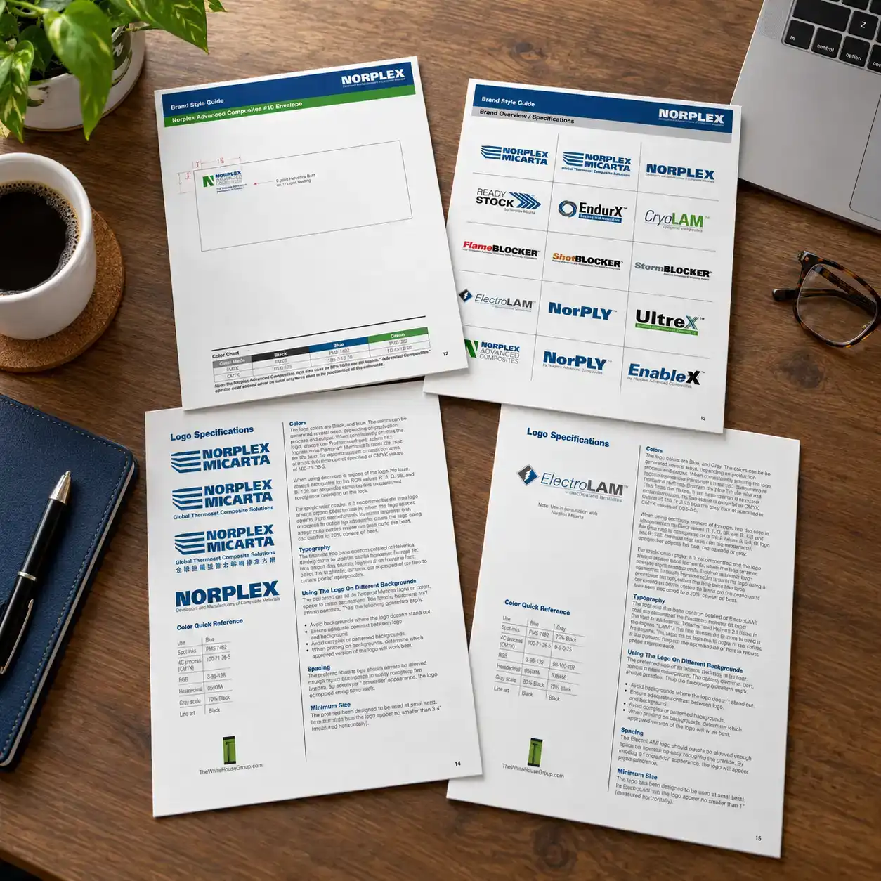
In practice — Norplex-Micarta
The details that keep a brand consistent.
A good identity needs to hold together after the original designer hands it off. For Norplex-Micarta, I developed a brand usage guide covering approved logo variations, color specifications, typography, spacing, background treatments, and the details required for consistent reproduction across a family of related identities.
The point was not to dictate every future design decision. It was to give the people using those identities the information they needed to get the details right without constantly coming back to the designer.
Stay close to the craft
Art direction is still made of details.
I am comfortable directing from thirty thousand feet. I am equally comfortable opening the file and finding out why something that is technically correct still feels wrong.
Type spacing. Crops. Alignment. Contrast. Image cleanup. Production limitations. The last ten percent of the work that somehow consumes thirty percent of the conversation.
That hands-on background matters because I do not see execution as the part that happens after the idea. Execution is where the audience actually meets the idea.
The concept gets the meeting. Craft earns the second look.
Direction without disappearing the designer
The goal is not to turn every designer into me.
When I am directing someone else’s work, I want to protect the idea and the standard without reducing the process to pixel-by-pixel instructions.
The designer should understand what the work needs to accomplish, where the visual language is going, and why something is or is not working.
Then there should still be room for talent, instinct, and a better answer than the one I happened to imagine first.
Good art direction gives the work a point of view without taking authorship away from the people making it.
What this says about how I work
I want the work to have a point of view before it has polish.
Polish is valuable. I have spent a career caring about it.
But polish cannot decide what the audience should notice, what the image should communicate, what the visual language should feel like, or why any of those choices belong together.
That part has to happen first.
If you strip away the decoration and the idea disappears, we probably decorated before we directed.