The real problem
The customer knew the part. The site needed to know the product.
The selection process depended on several variables working together.
- part cross-section measurements
- inch or millimeter input
- multiple diameters within the same part
- light, medium, or heavy sleeve requirements
Those inputs then needed to connect to actual product options and the technical properties associated with them.
So the job wasn’t to make a nicer form. It was to turn a technical selection process into an interaction.
The UX
Ask for the information the user already has.
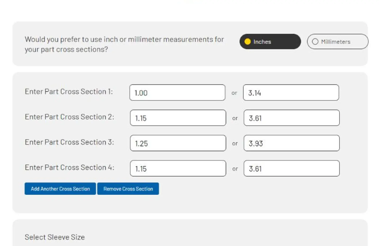
The calculator starts with the geometry of the part rather than forcing the user to begin with a product they may not know.
Users could work in inches or millimeters, enter multiple cross sections, and select the sleeve category that fit the application.
The interface handled conversion between measurement systems automatically, keeping the workflow focused on the part rather than the arithmetic.
The product recommendation came later. The user’s problem came first.

Behind the interface
The calculator had to do more than look interactive.
I built the application in PHP, CSS, and JavaScript, connecting the interface to a flat-file product database.
Once the user supplied the part information, the application could process those inputs and return product options tied to the requested specifications.
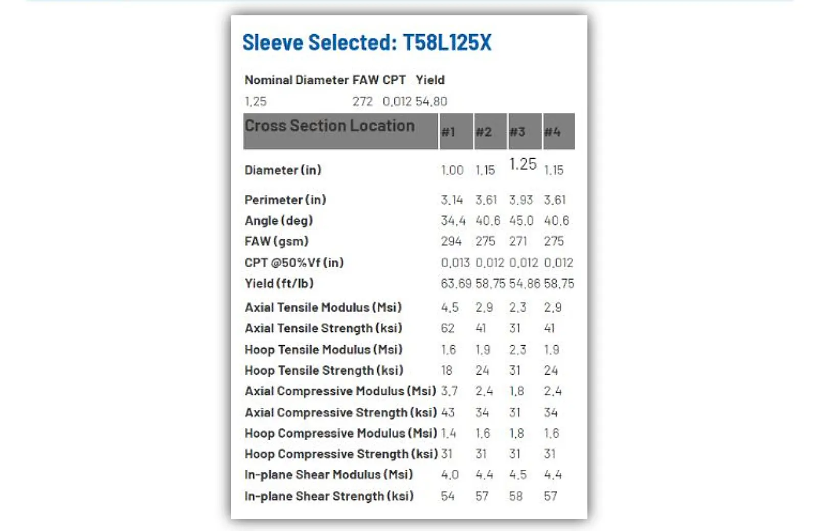
Selecting an option then exposed the corresponding calculated technical data for the part.
The interface wasn’t decorating the information. It was doing useful work with it.
The other half
A useful calculator can’t depend on a frozen product list.
The customer-facing tool was only part of the system.
I also created a simple backend that allowed A&P Technology to manage and expand the material data feeding the calculator.
That mattered because the application needed to remain useful as the underlying product information changed.
A custom tool is a lot less custom if every update requires rebuilding it.
What changed
The website stopped being just a place to describe products.
It could participate in choosing one.
Customers could enter the requirements of their part, work in their preferred measurement system, review applicable product options, and inspect the resulting technical data within the same browser-based experience.
- a customer-facing product-selection workflow
- automatic inch / millimeter conversion
- support for multiple part cross sections
- product-specific technical data generated from user selections
- a maintainable data source that A&P could update as needed
Not bad for something that started as “we need a calculator.”
What this says about how I work
I don’t need the design to stop where the comp ends.
Sometimes the right digital solution is a page.
Sometimes it needs logic, data, calculations, and a little more under the hood.
Being able to move between UX, visual design, and development means I can think about the experience as a whole instead of handing the hard part off at the edge of the screen.
The goal isn’t to write code. The goal is to make the complicated thing easier to use.