The communication problem
More services did not need to mean more visual noise.
Emergency medicine, surgery, internal medicine, ophthalmology, rehabilitation, anesthesia, specialty procedures, hospital philosophy, and physician credentials all needed space in the system.
Some audiences needed a broad introduction to IndyVet. Others needed a focused explanation of a specific service. Referring veterinarians and pet owners could also need very different levels of detail.
The answer was not one oversized brochure trying to carry everything.
It was a modular family of pieces that could become more specific as the conversation became more specific.
The presentation system
Make the folder smaller. Make the system more useful.
The core piece was a compact tri-fold pocket folder rather than a conventional oversized presentation folder.
It introduced the hospital, its philosophy, and areas of expertise while creating a polished container for the more detailed materials that could be selected for a specific audience or conversation.
The blue, green, and white palette kept the presentation clinical and clean, while photography brought people, pets, and the hospital environment into the story so the materials never felt sterile.
The folder established the brand. The pieces inside it did the explaining.
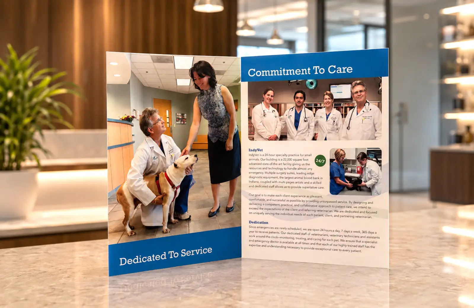

The specialty brochures
One visual language. Four different conversations.
Four 8.5 × 11 tri-fold brochures supported major specialty offerings, including services such as rehabilitation, specialty procedures, and advanced treatments.
The format created more room for photography and explanation than an individual insert while still remaining compact enough to travel with the presentation system.
The layouts use the same core brand architecture — the curved green-and-blue division, white clinical space, strong blue fields, and photography — but the content changes enough that each brochure can stand on its own.
Consistency should make a family recognizable. It should not make every member identical.
The service-line inserts
The detailed pieces had to explain medicine without looking like medical paperwork.
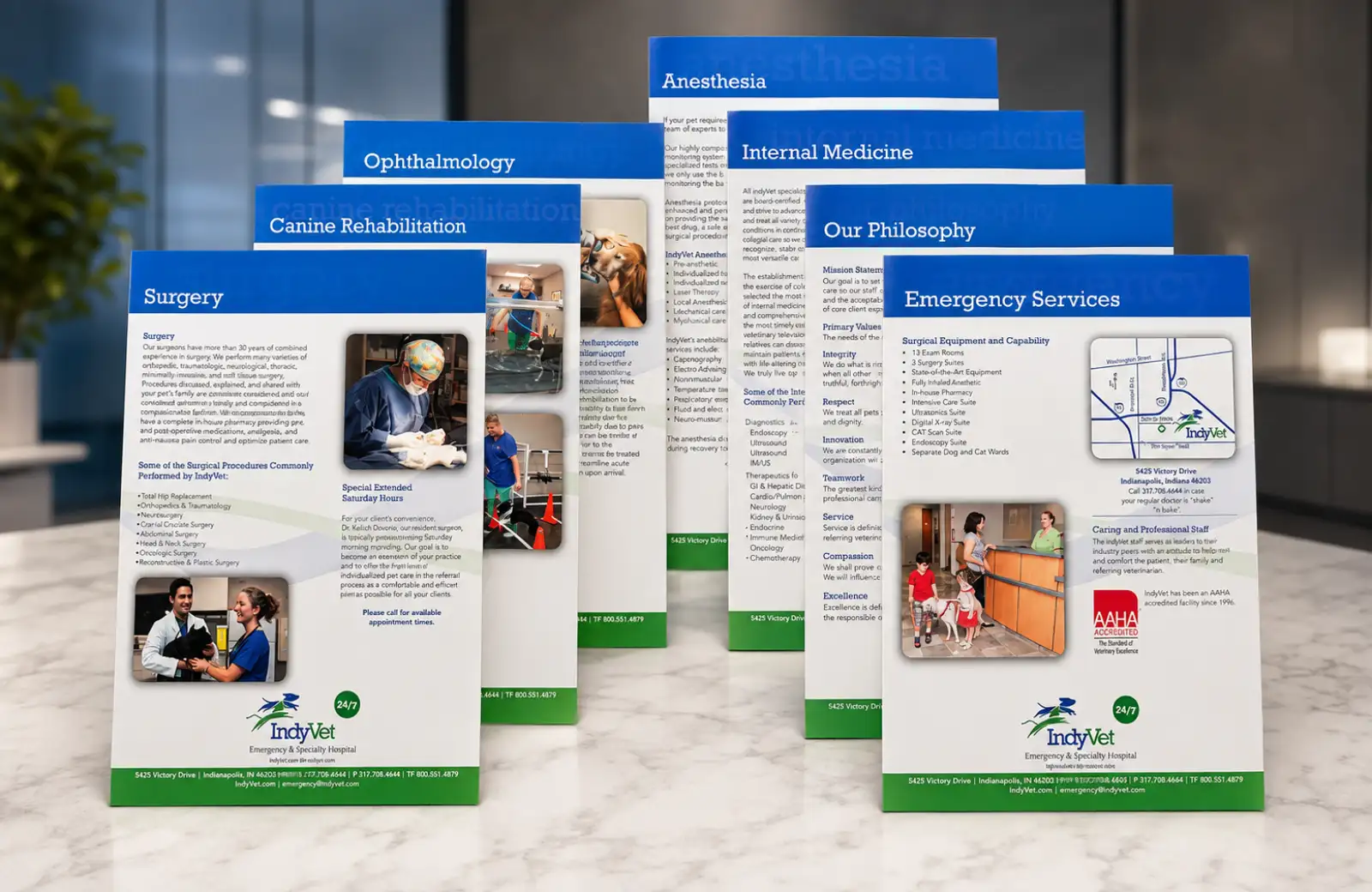
Seven service-line inserts handled subjects including emergency services, surgery, canine rehabilitation, ophthalmology, anesthesia, internal medicine, and the hospital’s philosophy.
These pieces carried substantially more information, so hierarchy became the design problem: section headings, short introductions, procedure lists, supporting photography, credentials, maps, and contact information all had to remain easy to scan.
The visual system stayed deliberately restrained so the reader could move through the content without fighting the design.
Clinical information already asks for attention. The page should help organize that attention, not compete for it.
Put expertise behind the service
Specialty medicine gets more credible when the reader can meet the specialist.
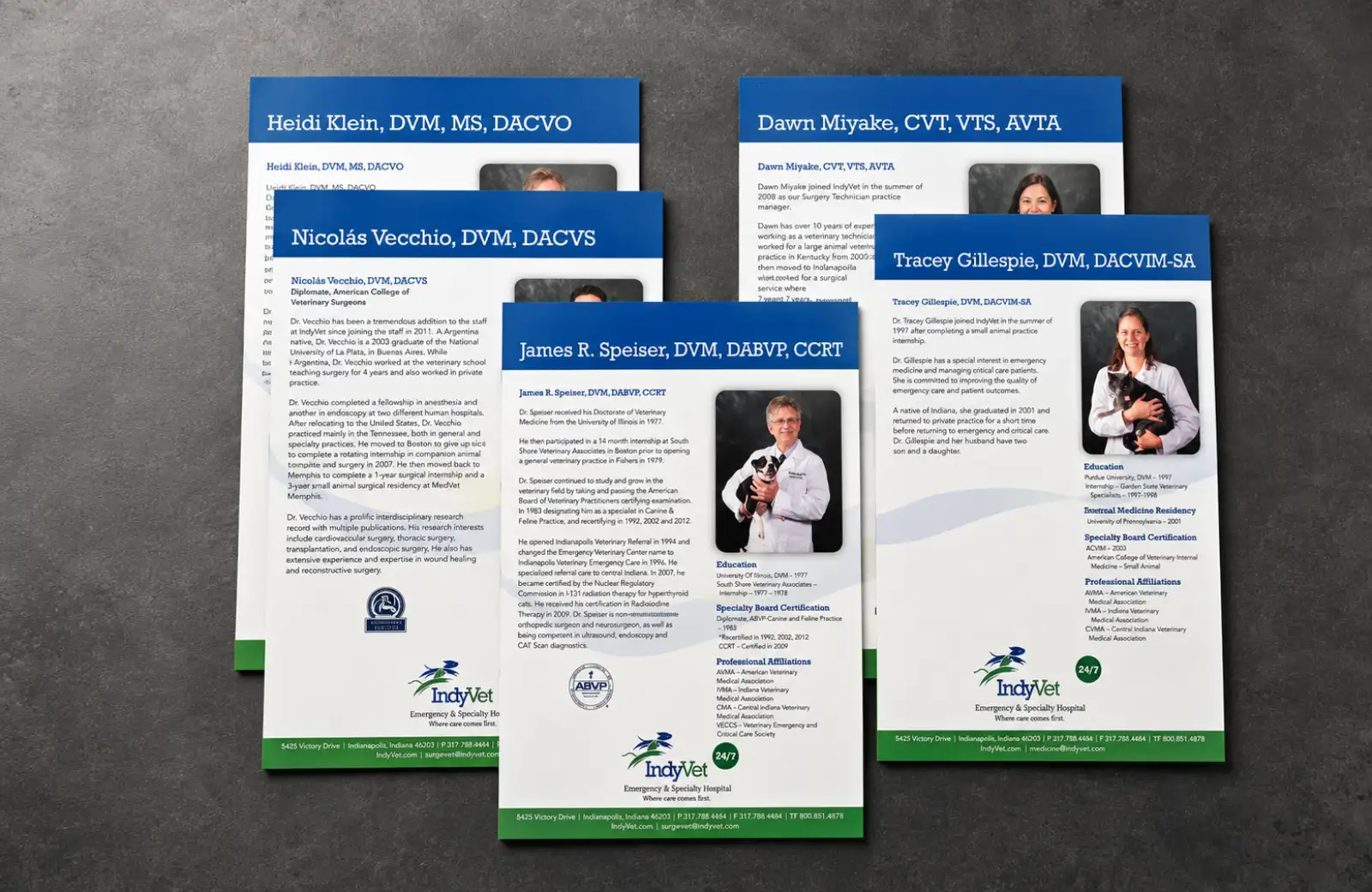
The reverse side of the service inserts was used for veterinarian biographies tied to the relevant specialties.
That gave the system another layer of useful information without requiring another standalone piece: education, board certification, professional affiliations, areas of expertise, and the people responsible for the care being described on the front.
It also made the communications feel more human. The hospital was not just presenting a list of capabilities. It was presenting the professionals behind them.
The service explains what IndyVet could do. The biography explains who would be doing it.
The craft behind the system
Clean design still has to survive photography, ink, paper, varnish, and a press.
My role extended well beyond the layouts. I assisted with copy development, supported the photography shoot and its art direction, selected additional stock imagery where original photography was not the right answer, and handled image refinement and color correction.
I also prepared the pieces for production, selected paper stocks and finishing specifications, coordinated with the printer, and managed the work through final output.
The finished materials used substantial paper stocks and satin-varnish finishes that gave the system a premium tactile quality appropriate to a specialty hospital presenting advanced care.
The work needed to look clinical and precise on screen. In someone’s hands, it also needed to feel considered.
A relationship built over time
The work evolved because the organization did.
IndyVet was a long-term client relationship spanning more than 15 years, with ongoing creative support across a wide range of marketing and communication needs.
Over that time, the organization evolved significantly — expanding its specialty services, clinical expertise, facilities, and the depth of information it needed to communicate to pet owners and referring veterinarians.
This collateral system was developed as part of that broader relationship. The challenge was not simply to create another brochure, but to organize an increasingly complex range of services into a cohesive, flexible system that felt appropriately clinical, professional, and reassuring.
The brand had grown. The communication system needed to grow with it.
What the work became
A modular clinical communication system built to scale with the conversation.
The finished program gave IndyVet a premium family of materials that could introduce the hospital broadly, explain individual specialty services in more detail, and put specific physicians and credentials behind those services when the audience needed another level of proof.
- a compact tri-fold pocket-folder presentation system
- four coordinated specialty-service brochures
- seven information-rich service-line inserts
- physician biographies and credentials integrated into the modular system
- original and selected photography carried through a consistent visual language
- premium print production, paper specification, finishing, and vendor management
The system could stay consistent without asking every audience to read the same amount of information.
What this says about how I work
Clarity is part of the craft.
Healthcare-adjacent communication does not benefit from visual theatrics for their own sake.
The work has to earn trust, organize complicated information, respect the expertise behind it, and still feel approachable to someone who may already be worried about the reason they are reading it.
That requires design judgment, information hierarchy, photography, production knowledge, and enough restraint to know when the content deserves the attention.
The system looked clean because a lot of decisions had already been made for the reader.