The creative problem
The product had features. The postcard needed an argument.
Wireless charging can be explained through convenience, safety, reduced connector wear, automatic charging, and a simpler daily routine.
But a postcard arriving with the rest of the mail does not have the luxury of beginning with a product briefing.
The first job was to find a human entry point strong enough to earn attention.
Same technology. Different reasons to care.
Exploring the territory
Before choosing an answer, I wanted more than one kind of answer.
Nine concepts were developed around different ways into the same product story.
Some made plug-in charging feel obsolete. Some turned the cable itself into the problem. Some leaned into convenience. Others pushed into fear, humor, or the lifestyle the audience was already enjoying.
The goal was not nine ways to decorate the same headline. It was nine attempts to find the strongest argument.


Make the old behavior feel old
Sometimes the easiest way to explain what is new is to make the alternative look finished.
The obsolescence concepts did not spend much time teaching wireless charging.
They reframed plugging in as the outdated behavior.
That opened the door to humor, analogy, and visual shorthand instead of technical explanation.
If the audience understands the problem in a second, the product gets the next few seconds for free.
Turn the cable into the problem
“Wireless” gets more interesting when the wire starts feeling ridiculous.
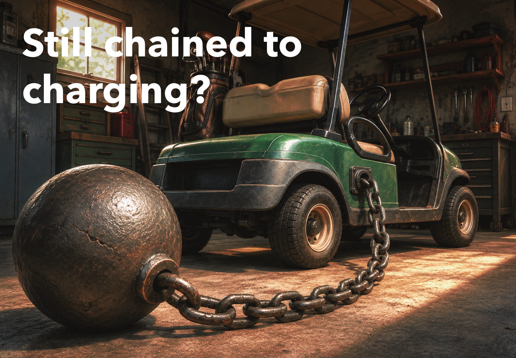
Another direction focused on the physical relationship between the cart and its charger.
A cable does not just deliver power. It is something the driver has to remember, handle, connect, disconnect, and work around.
The ball-and-chain concept pushed that inconvenience into a visual metaphor that could be understood before the copy was read.
Cut the cord. Not the fun.

Change the emotional temperature
The campaign did not have to shout every time.
“Someone’s Ready!” approached the same benefit from the other direction.
No warning. No obsolete technology. No problem to dramatize.
Just the small pleasure of walking outside and finding the cart ready when you are.
Convenience is not always about saving time. Sometimes it is about removing one tiny thing from the day.
The finalists
The final two were not chosen because they looked most alike.
They were chosen because they did not.
The planned A/B test put two very different emotional hypotheses against each other:
- Interruption / consequence: make the risk and hassle of conventional charging impossible to ignore
- Lifestyle / aspiration: protect the ease and enjoyment the audience had already built into daily life
The useful question was not which postcard looked better. It was which reason to care moved the audience.
Final direction one
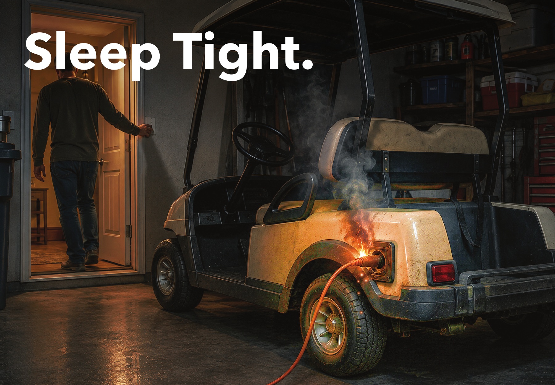
Sleep Tight.
The interruption route was deliberately uncomfortable.
A charging cart smoking in a dark garage creates the tension before the headline has to explain anything. “Sleep Tight.” makes the calmness of the words work against the image.
The reverse side then pivots away from fear and back to the benefit: charging should be one less thing to worry about.
The visual gets the attention. The product gets to resolve it.

Final direction two
Your lifestyle is already a vacation.
This route did not dramatize a charging problem at all.
It showed the product inside the visual language of the audience’s lifestyle: a beautiful home, warm Florida light, a golf cart waiting in the driveway, and nothing that feels like work.
The benefit becomes almost invisible.
The technology is there to preserve the ease, not interrupt it.
The production model
The concepts needed custom imagery. The budget did not need a photo shoot.
The campaign imagery was developed through an AI-assisted creative workflow and then refined, composited, retouched, and finished in Photoshop for the specific concepts.
That made it possible to create scenes that would otherwise require locations, vehicles, talent, props, photography, and substantial production time – while keeping the creative development in-house.
AI accelerated production. It did not choose the audience insight, write the concepts, decide which visual metaphor worked, or determine what was worth showing.
The tool made more ideas practical. Judgment still decided which ideas were good.
The test that was planned
If two ideas are going to compete, learn something from the competition.
The campaign was planned as an Every Door Direct Mail test reaching more than 70,000 households in The Villages.
Separate QR codes, UTM tracking, and dedicated phone numbers were planned so response could be attributed to each creative direction.
That mattered because the test was bigger than one mailing.
A winner could have helped shape future messaging by showing whether this audience responded more strongly to avoiding a problem or protecting a lifestyle.
What happened
The work reached production-ready creative. The mailing did not happen.
The campaign was canceled before launch as a business decision, so there are no response numbers to turn into a tidy results chart.
That changes what this case study can claim. It does not change what the work demonstrates.
- consumer audience thinking for an unfamiliar technology
- multiple viable creative territories rather than one predetermined answer
- concept development, copywriting, art direction, and hands-on execution
- AI-assisted production used to expand creative possibilities while controlling cost
- a measurement plan designed before the campaign went into market
The campaign never got its results. The thinking still got all the way to the starting line.
What this says about how I work
I do not need the first idea to be the answer.
I would rather explore enough territory to understand the choices.
What happens if the message is funny? What happens if it is uncomfortable? What happens if the technology disappears almost completely and the lifestyle becomes the story?
Then narrow the work for a reason – and, when possible, build the measurement into the idea before it leaves the building.
The creative process gets faster with better tools. The responsibility to choose well does not.